In the lesson when Hannah was editing the music video, Rebecca and myself decided to produce several print work for advertisement and album cover on Adobe Photoshop. We wanted to make the album cover cohesive to the music video, so we took screen shots of different parts of the video, cropped it and added some Photoshop elements. We were strongly against the idea of using the band members on the print work as after researching some metal-core advertisement or album cover, none of them used their image.

The following images are possibility for the album cover and advertisement.
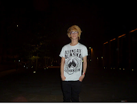
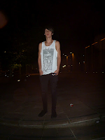
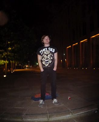
- Live footage of the band
- Rebecca's brother carving on his arm
- Robynne and James walking away from the camera
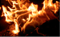
- Lyrics burning on a paper


After Photoshop


Before Photoshop
After Photoshop


Before Photoshop
After Photoshop


Before Photoshop After Photoshop
I had to create the live image while Rebecca did the rest. I started off by creating a new document on Photoshop After I did that, I changed the paper size to International paper, A4 and then I changed the paper from portrait to landscape so that the band members had a better fit on the page. I then dragged the image from the desktop on to the document opened on Photoshop.

Creating a new document on Photoshop
I then decided not to crop any parts of the picture because I thought if I tried to have an equal sharp in all the 4 angles, then I might cut out some of the band members. After we decided what font we should use on the band name, album title and any additional information, I then had to decide what colours will work best on the cover. We decided to use the same font for the band name on all our covers. And then we could choose what font is most suitable for the rest of the writing on the covers as long as the other group members thinks it works well. The font we decided to use for the band name through out the print work is "Handwriting Dakota".

Choosing font for band name
As a group, we decided what should be on the the covers, From looking at examples of the different metal-core print work, we choose the following;

Additional information to include on print work.
After we finished some of the print work, Rebecca asked for some feedback from some of our target audience in the sixth form. When asked what cover they will like on our album, most of our audience picked two covers; the one with the lyrics burning up in flame and the "Fuck". We started thinking of ways to use both the images, using one for the front cover of the album and the other for the back cover. Rebecca then came up with an idea of merging both images together to use both for our front cover album.

Finished front cover
However, because there is swearing on the cover, we don't think it will be suitable for our target audience and we also thought that hypothetically speaking, some retail markets might refuse to sell the CD. We though that the only advantage of using swearing on the front cover is that because it will be controversial, it might gain popularity and so increase the band's audince.
We also wanted to make a booklet for our album so as to introduce our band the to their audience and to give the target audience a bit more information about the band members. Rebecca created the panes for the booklet. she used the following images.
Creating the booklet:
We wanted to create a booklet for the album; that could have information and images of the band members as it is conventional to this genre and will reflect the age group of the target audience. With the help of Hannah and myself, Rebecca started by creating a new document on Photoshop, and then dragged individual images of the band members on to the new opened document.

Creating a new document on Photoshop

Merged images of the hand and the fire
Pane 2: This is of the band members standing in the group and individually after their performance. Rebecca created this pane by dragging the pictures into a new document on Photoshop, and then she cropped the edges of each picture to make it fit better on the page. To write on the page, Rebecca had to changed the order of the layers so that the writing overlaps the pictures and stand out.

Blow are the images Rebecca used Pane 2
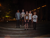
Remember the Ruined-band members
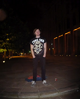
James Seccombe
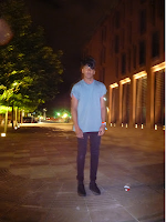
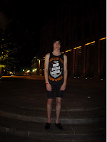
James Artherton Pro Roy
Jake Fox Ian Gregory

Changed layer
Blow are the images Rebecca used Pane 2

Remember the Ruined-band members
James Seccombe


James Artherton Pro Roy


Jake Fox Ian Gregory

Finished pane 2
Pane 2: This pane is the lyrics of the song 'Stubborn Memories'. Rebecca rotated the image 90 degrees anti-clockwise and placed it on a 12x12cm Photoshop page; this is almost the size of a CD. she used the free transform tool to stretch the image on the page and then used the Magic wand to delete the
edges so that it fits better on the page.


After rotating
Rebecca then dragged the three images against each other so that it makes the first side of the album booklet. To do this, she simply created another document of photoshop and from the already open document, she dragged first, the album cover to the left side of the page so that when the booklet is folded, it is on top. she then dragged the image of the band members and then she added the image of the lyrics on the right side of the 12x12 paper.

Rebecca then created the back of the booklet. The forth pane is a black and white image of the fire. The only change Rebecca did to this image was change the original colour to 'grey scale'. She then flatten the image to save it as JPEG.
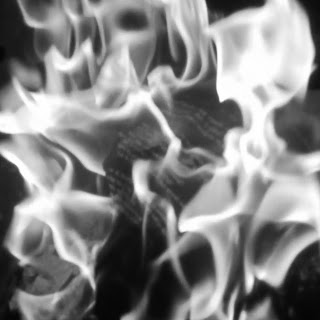
coloured image
grey scale
Pane 5: For the fifth and sixth panes are collage images of the band members performing live at the Fleece in Bristol. Rebecca did this by dragging the images onto a new 12x12 page on photoshop. She then cropped the edges of each image so that when put together with other images, it fits well on the page. She used a mixture of coloured and grey scale images, and then flatten the image so as to save it as JPEG.

Pane 6: She used this page as a thank you page for everyone who was involved in all the stages of the video. We thought it was a good idea to have a thank you page because when researching metal-core albums, a lot of artist used it and it can be seen as a general convention for all music genre.


Finally, Rebecca created the back cover of the album. We had already decided to use the image of Robynne and James walking away from the camera as it was one of the popular images with our target audience.

No comments:
Post a Comment