Thursday, 22 November 2012

Creating Gig poster


Rebecca asked some audience feedback from her friends and from some people in the sixth form what they thought and will expect to see on a metal-core album cover. Most people liked the idea of Robynne and James walking, "FUCK" and the image of fire for magazine  advertisement and album covers, but were all against the idea of using a live footage for a cover. They suggested that we should use the live footage to make gig poster instead as the band performance a lot at the Fleece Bristol. Rebecca asked me to do this and with some help and confirmation from the rest of the group, we all decided what we should include.

I used Photoshop again to do this and open a new document. We were undeceive of what to include on the post and where each information should be on the page. We used the same information from the magazine advertisement and include at the bottom of the gig poster. We decided to leave the name of the band at the top of the page. Adding the colour was a bit tricky because the natural background colours of the image were darkish and muted. We settled on red at last because it is one of the colours we used through out our print work so it will make the poster cohesive to the the album cover. We also used red because it was a different colour from the stage lighting and so stands out. The text colour we choosed was  R: 168 .


                                        Choosing a suitable text colour.

We also wanted to keep the font of the band consitent through out our print work, so we used Handwriting Dakota font.


                                                       Handwriting Dakota font

I did two poster; one of which the band is not fully fitted on the page and the other is the one we decided to use and the band is well fitted on the page. I did a half fitted picture because I thought writing on the white background will be better rather than using different colours through out the poster. However, Rebecca did not like it because she felt it looked unprofessional and so wanted the picture to be fully fitted on the  page.


Below are the posters we made;


White borders 
                                                                                                                    Full fitted image.

We choose the full fitted poster because it is cohesive to the print work and music idea. It also looks better generally.

6/11/12- Creating the album cover and booklet


In the lesson when Hannah was editing the music video, Rebecca and myself decided to produce several print work for advertisement and album cover on Adobe Photoshop. We wanted to make the album cover cohesive to the music video, so we took screen shots of different parts of the video, cropped it and added some Photoshop elements. We were strongly against the idea of using the band members on the print work as after researching some metal-core advertisement or album cover, none of them used their image.


                                                           Photoshop


The following images are possibility for the album cover and advertisement.
  1. Live footage of the band
  2. Rebecca's brother carving on his arm
  3. Robynne and James walking away from the camera
  4. Lyrics burning on a paper


Before Photoshop
                                                                                             After Photoshop
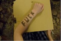


Before Photoshop                                                                                          
                                                                                                                  After Photoshop
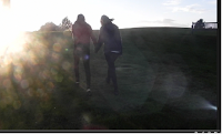


Before Photoshop
                                                                                                                        After Photoshop                   
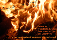


Before Photoshop                                                           After Photoshop



I had to create the live image while Rebecca did the rest. I started off by creating a new document on Photoshop  After I did that, I changed the paper size to International paper, A4 and then I changed the paper from portrait to landscape so that the  band members had a better fit on the page.  I then dragged the image from the desktop on to the document opened on Photoshop.


Creating a new document on Photoshop


I then decided not to crop any parts of the picture because I thought if  I tried to have an equal sharp in all the 4 angles, then I might cut out some of the band members. After we decided what font we should use on the band name, album title and any additional information, I then had to decide what colours will work best on the cover.  We decided to use the same font for the band name on all our covers. And then we could choose what font is most suitable for the rest of the writing on the covers as long as the other group members thinks it works well. The font we decided to use for the band name through out the print work is "Handwriting Dakota".


Choosing font for band name


As a group, we decided what should be on the the covers, From looking at examples of the different metal-core print work, we choose the following;

Additional information to include on print work. 


After we finished some of the print work, Rebecca asked for some feedback from some of our target audience in the sixth form. When asked what cover they will like on our album, most of our audience picked two covers; the one with the lyrics burning up in flame and the "Fuck". We started thinking of ways to use both the images, using one for the front cover of the album and the other for the back cover. Rebecca then came up with an idea of merging both images together to use both for our front cover album


Finished front cover


However, because there is swearing on the cover, we don't think it will be suitable for our target audience and we also thought that hypothetically speaking, some retail markets might refuse to sell the CD. We though that the only advantage of using swearing on the front cover is that because it will be controversial, it might gain popularity and so increase the band's audince.  
We also wanted to make a booklet for our album so as to introduce our band the to their audience and to give the target audience a bit more information about the band members. Rebecca created the panes for the booklet. she used the following images. 


Creating the booklet: 
We wanted to create a booklet for the album; that could have information and images of the band members as it is conventional to this genre and will reflect the age group of the target audience. With the help of Hannah and myself, Rebecca started by creating a new document on Photoshop, and then dragged individual images of the band members on to the new opened document.


Creating a new document on Photoshop

Pane1: The first pane is the album cover.  Rebecca created it by using two different images of from our main product. She merged together the image of the lyrics burning, and the image of the word 'Fuck' on the arm.  She did this by adding the image of the arm first before adding the image of the fire on top of it, so that it looks like the arm is on flames. This means that we are not over using on particular picture which could be seen as offensive or controversial, but by using both images, the word on the arm is less controversial, but the cover is more effective as it might draws the audience's attention as they might want to know what is burning up. 


                                                     Merged images of the hand and the fire


Pane 2: This is of the band members standing in the group and individually after their performance. Rebecca created this pane by dragging the pictures into a new document on Photoshop, and then she cropped the edges of each picture to make it fit better on the page. To write on the page, Rebecca had to changed the order of the layers so that the writing overlaps the pictures and stand out.


Changed layer


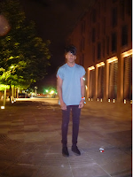
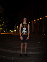
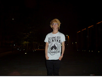
Blow are the images Rebecca used Pane 2
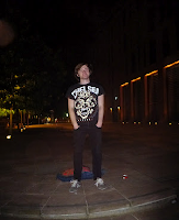


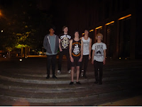
Remember the Ruined-band members                                                                 
                                                                                                                James Seccombe


James Artherton                                                                                                       Pro Roy 


Jake Fox                                                                                                     Ian Gregory


Finished pane 2


 Pane 2: This pane is the lyrics of the song 'Stubborn Memories'. Rebecca rotated the image 90 degrees anti-clockwise and placed it on a 12x12cm Photoshop page; this is almost the size of a CD. she used the free transform tool to stretch the image on the page and then used the Magic wand to delete the 
edges so that it fits better on the page.


Before rotating
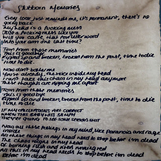


                                                                                                      After rotating


Rebecca then dragged the three images against each other so that it makes the first side of the album booklet. To do this, she simply created another document of photoshop and from the already open document, she dragged first, the album cover to the left side of the page so that when the booklet is folded, it is on top. she then dragged the image of the band members and then she added the image of the lyrics on the right side of the 12x12 paper.


                                                        The first three panes


Rebecca then created the back of the booklet. The forth pane is a black and white image of the fire. The only change Rebecca did to this image was change the original colour to 'grey scale'. She then flatten the image to save it as JPEG.
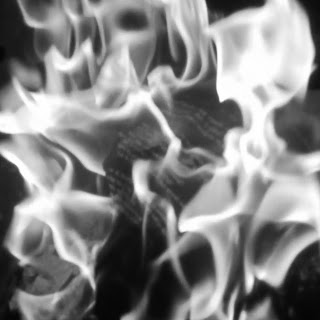


coloured image


                                                                                              grey scale


Pane 5:  For the fifth and sixth panes are collage images of the band members performing live at the Fleece in Bristol. Rebecca did this by dragging the images onto a new 12x12 page on photoshop. She then cropped the edges of each image so that when put together with other images, it fits well on the page. She used a mixture of coloured and grey scale images, and then flatten the image so as to save it as JPEG.


                                                            pane 5- live images 


Pane 6: She used this page as a thank you page for everyone who was involved in all the stages of the video. We thought it was a good idea to have a thank you page because when researching metal-core albums, a lot of  artist used it and it can be seen as a general convention for all music genre.


                                                        Pane 6- thank you page


                                                                       back booklet


Finally, Rebecca created the back cover of the album. We had already decided to use the image of Robynne and James walking away from the camera as it was one of the popular images with our target audience.


                                                                Album cover


Print work- Album covers and Magazine Advertisment


After looking at still images that could be suitable for the front/back album cover, we looked at the common conventions between a magazine advert and an album cover. In lesson, we looked at Ellie Goulding's album cover and magazine advert "Lights" and Oasis album "Be Here Now". 

We looked at the similarities between the album cover and the magazine advertisement: Ellie Goulding- Lights


                                                     Ellie Goulding - Lights magazine advertisement


Ellie Goulding - Lights album cover
  • Both the magazine advert and album cover has the image of the artist. This publish when she just started, and so he image use so that she might be easily recognised by her audience.
  • Muted colours of sparkling gold and black are used on both magazine and album
  • Her name is written written with the same font on the album and the magazine which stands out and is almost recognised as a logo.
  • Her achievement,  awards and reviews are written on the magazine which is important as a new artist to show of her talent.


Oasis- Be Here Now


Oasis - Be Here Now- magazine advertisement 


Oasis -  Be Here Now- album cover
  • The album and the magazine advert uses shared image. The magazine is a mid-long shot of the album cover which is a close-up shot. 
  • The Oasis logo is on both covers
  • Unlike Ellie Goulding's covers, the Oasis did not use any image of themselves on the magazine advert. This is because they are establish enough, and their audience are able to  recognise them through their logo. The use of their picture on the album cover could be to stand out in the competitive music market. 
  • The band's website is written on the bottom of the magazine to inform the audience where the album can be downloaded. This also emphasis the importance of technology in this age. 
After looking at this album covers in lesson, I decided to look at album cover and magazine adverts from the metal-core genre. I looked at Bullet For My Valentine their album Fever and Bring Me The Horizon their album Suicide Season. 

Bullet For My Valentine - Fever

Fever - Album cover                                       


                                                                                   Fever - Magazine advertisement

  • Both the album cover and the magazine cover have a shared image of  girl who is standing naked on the album. The picture could be criticised for "Male gaze" as it objectifies the woman on the cover.The  band members did not use pictures of themselves which is not unusual as bands from this genre hardly ever use their own pictures. 
  • Both the album cover and magazine advert uses the same sanserif font for the name of their band which is used in all their print work and can be represented as the band's logo. The name of the album "Fever" is also written in the same font on both covers.
  • Compared to the Oasis and Ellie Goulding's print work, Bullet For My Valentine has more information about their album on the magazine cover than the album. This might be because fans buying the magazine will be directed to the website where they can download the album and find other information about the band. 
  •  Mise-En -Scene elements used on the album and magazine include under-exposed lighting and dark muted colours   


Bring Me The Horizon - Suicide Season


Suicide Season- album cover           Suicide Season- Magazine advertisement


  • Both covers used shared image of a girl on cover, and  unlike Ellie Goulding's print work, there is a lack of band imagery for advertisement or promotion of the band. Oasis did not need it because there are already well establish and the do not rely on the extra advertisement to sell the album. 
  • Mise- En-Scene elements includes the theme of black and blue colours;  the blue colour is used as the font colour on both the album cover and magazine advert and it is also used for the bubbles the girl is holding, while the black is used on the girl (black dress). The lighting used in the covers looks natural which is unusual for this genre as they always use dim colours to reflect the mood of the album. 
  • The name of the band is not prominent on the album cover as we will expect it to. However, their fans will recognise the band as they do not have a consistent logo or a way of being represented. 
From looking at the above examples and focusing particularly on the metal-core genre as it will be useful to use for our own print work, I thought that we could include the following on our album cover and magazine advert; the use of under-exposed lighting and dim colours on our album cover. We also want to use still images from the music video to make the album cover cohesive and easily recognised during advertisement. We do not plan to use a shared image for the album cover and magazine advertisement as we wanted a  cohesive imagery with to music video


Tuesday, 20 November 2012

Editing

6/11/12                                                 Rebecca's brother drawing "FUCK" on his arm.

At the start of this week, Hannah did most of the editing while Rebecca and myself started the print work for our album advertisement. Hannah imported the footage of Rebecca's brother writing the word "Fuck" on his hand. She also had to split the to put the footage of the "fuck" in-between the current footage of James and Robynne walking in the park so that it matches the lyrics. 

After splitting the clip, Hannah found that the iMovie started freezing the ends of new imported clips. As a group, we decided not to do anything about this because when we first started and had the same problem, our teacher advised us that the footage might stop freezing when we import it to a disc. 

Hannah was also able to add a footage of Robynne and James walking in the park, in-between a shot of Ian walking away from Robynne to make the visual faster and choppier so that it matches that sound. Myself and Rebecca thought Hannah's idea works well as the audience will sympathise with Ian's character, and so continuing the narrative.


                                                                                   James and Robynnne walking away together

7/11/12

During this lesson, we ask some students in class to watch and give us feedback of our video so far. We asked four questions and they include;
  1. How do you think our video reflects the metal-core genre?
  2. What do you like/dislike about the video?
  3. How do you think the editing works with the visuals?
  4. How can we improve the video?


Feedback from qestionnaire


Not everyone in our class listens to the metal-core genre, so we had a range of views from our classmates. Someone said "Imagery/motifs reflect genre and target audience;fire writing on arm, live gig" for question one. Another person said "I like pace of the editing and with the music" for question 2, "I don't actually know what the song is saying" for question 3 and and for question 4, someone said "develop storyline in the background do it makes sense".

After knowing that our storyline might be confusing for some of our audience, we decided to move and add some footage. We thought that our audience might be getting confused by the difference between the two male characters , James and Ian. They might not know who is breaking up with Robynne and who went together with her.  So we decided to add a footage of Robynne and James walking towards the camera in-between Ian walking away so that the audience can see that Robynne is no longer with Ian; and has moved on. This works well because the idea of Ian walking away emphasis the lyrics of a couple breaking up and one moving on. 


James and Robynne hand in hand


8/11/12

During this lesson, we wanted to make our video easier to look at and understood by our audience. Hannah took out the footage of Robynne and James walking and replaced it with Ian and Robynne walking to keep the narrative clear. She also change the footage so that we could use it later in the video. After watching the video on the full screen, Hannah also spotted an editing error. When Ian first walk away from the bench, he is just about to turn the corner. We cut that shot to live shot, and to another narrative shot which means that a few minutes must have gone. However, when we went back to that shot, he is still in the same position, so there was no continuity. Hannah changed this shot and put it forward so that continuity is achieved. 
Hannah thought by Ian walking away from their breakup, the audience only sympathsed with Ian's character, so she decided to add a shot of Robynne smoking on the bench and looking sad. She changed the saturation from the average of 51% to slightly darker 49% so that the mood of the video is quit depressing and the audience can see that Robynne is also affected by their breakup.


Robynne sad about their break-up


Hannah changed the saturation for that shot to make it deem.


13/11/12


This a zoom in image of the blurry shot we used.


Clear shot
During this lesson, I decided to do some editing with Hannah along with some feedback at each stage from Rebecca. I thought it will be a good idea to change the steadyclear shot of Robynne and James sat on the bench in the park to a blurry, hand-held shot of both of them on the same bench. The blurry shot moves away from them, so the audience are kept in suspense as they wait to see who she is with (James or Ian?). We didn't just put in the blurry shot in the video because it might look good. We thought it could be a metaphor for memory and relationship. We then cut back to the shot of the arm progressing, and then to a live footage of Ian playing the drums, and then back to the zoom out shot revealing who is sat on the bench.

We then cut to the shot where Ian is walking away at the top of the park by the lane. The idea behind putting a shot of James and Robynne in the park together before adding a shot of Ian walking away is to show that he knows about Robynne's relationship with James and he has come to accept it and is moving on. For the shot of Ian walking away alone, we changed the saturation to 55% to emphasis his sadness.


Saturation of 55% to dull the mood

We thought it will be better to make the video choppier as it's an important music convention in this genre. We cut 0.9 seconds from the shot of James and Robynne talking on the bench and 0.5 seconds from the shot of Ian walking away.
                                                                                         shorter cuts to make it choppier

Hannah and Rebecca tried to trim out the man talking

Cutting off the shots allowed time to add in a fire shot before cutting back to the shot of Ian walking away. By the end of this lesson, we had reached the part of the music where an unknown male's voice is talking over the music and we  think was an editing error, and so Hannah and Rebecca decided to try and cut it out, but without releasing, they ended up removing the lyrics out of synchrony with the visuals. During the next lesson, Hannah and I decided to start editing the music again to make it synchronise with the live footage at the start of the video, and Hannah later came back during her free lesson and finished the editing.